Product update: Meet Browsealoud v3
Browsealoud has been given a revamp and it’s now faster, more efficient and more accessible than ever before. In this blog, you’ll find all the details you need to know about the latest update, so have a quick read and check out version 3 for yourself.

First, we hear from Michael Beckett, Texthelp’s Development Manager, on the rationale behind Browsealoud’s fresh design and functionality...
“Since Browsealoud’s first release it’s hard to believe how much the web has changed, and we felt the time had come to bring Browsealoud up to modern standards - to make it faster, improve its compatibility with modern websites, improve performance, and bring a completely new look and feel to the product.
We’ve invested heavily in this new version of Browsealoud, expanding our development team to meet the challenge, and providing all the resources needed to make Browsealoud v3 a success. We hope our customers will appreciate the new UI design and find the new features we’ve added useful.
This is so much more than a simple revamp - we’ve taken our beloved old Browsealoud back to the car dealer and we’ve swapped it for a new model fit for the 2020s. I hope you enjoy the ride!”
So, what’s changed?
A slicker design & more compact placement
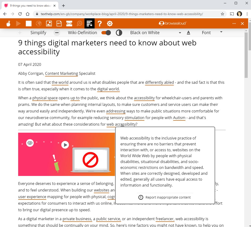
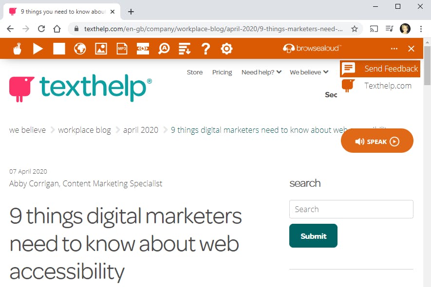
Firstly, we’ve updated the design of the toolbar, giving it a much sharper look and clearer visibility - with a deeper depth of colour, the toolbar pops against the backdrop of common website designs, making sure it can be viewed easily by the user. The user can also change the colour theme of the toolbar to a colour contrast that works for them (available in the ‘Settings’ menu).
Not only that, we’ve updated the placement of the toolbar - when it’s launched, you’ll notice that the toolbar docks to the top of the webpage browser. This means that as the user browses the web page it remains instantly accessible to them, without getting in the way.

Enhanced feature set
We’ve enhanced the functionality of some of the features, including…
Web page ‘Simplify’
We’ve improved the simplify feature by increasing the accessibility of the simplified content. As normal, users can choose to increase or decrease the amount of content that’s simplified; select a colour contrast option that works for them; and, change the size of the text. However, users can now also select a font of their choice, allowing them to read online content in a font that’s accessible to them. We’ve also updated the colour contrast options, and made selection much easier with a drop-down menu. And, brand new is the addition of ‘Wiki-definition’, providing users with word definitions at the click of a button.

The ‘Pause’ function within ‘Text-to-Speech’
We’ve improved this feature to ensure a seamless user experience, allowing the user to confidently use the popular text-to-speech function in a way that suits them best.
Improved personalisation
We want to make sure Browsealoud helps to improve web accessibility for each and every user - and that’s why the ability to personalise the user experience is so important to us.
As already noted above, we’ve made a few new additions to increase accessibility for every user - like changing the colour theme of the toolbar, and the font on a simplified web page - and, to make sure users can personalise their experience as easily as possible, we’ve also updated the ‘Settings’ menu.
With a fresh new look, the menu is now much more clear and accessible, helping users to customise Browsealoud much more efficiently.
...and, that’s not all!
We’ve given users the chance to tell us all about their experience, with a new user feedback survey. That means we’ll get to hear directly from end users, to help us keep improving Browsealoud to meet their needs.

Lastly, we’ve also removed our Browsealoud cookie and security banner notification, so users will only see your own cookies banner and privacy policies, giving them a better experience. (please note: if you’re a current Browsealoud customer, we recommend that you add Browsealoud’s cookie settings to your own cookie settings, using our recommended text).
We’re sure you’ll agree that Browsealoud v3 is the best version of Browsealoud yet! If you have any questions, or would like to learn more, visit our customer support article, or feel free to get in touch.
If you’re not yet a Browsealoud customer, you can try it out on your own website free for 90 days.
